

If I asked you to gesture with your hands which direction is the future and which is the past, what would you do? Front is the future and behind is the past? Right is the future and left is the past?
But some cultures see it completely differently. And that means as designers of things, we need to take that into account. The people who use your thing may not have the same “knowledge in the head” as you.
Which way is tomorrow?
Ok, let’s start high up in the Andes mountains, with the Aymara people, who live across Bolivia, Peru and Chile. In their language, the word for front, nayra, also means past, and the word for back, qhipa, also means future. So “last year” is literally “front year”. When researchers filmed Aymara speakers talking about time, the ones who only spoke Aymara pointed in front of them for the past and behind them for the future.

When I first read this, it honestly made no sense to me, because it’s the opposite of something so basic that I grew up with.

But the more I thought about it, the more it clicked. You can see what’s in front of you, and you know what happened in the past. The future is the part you can’t see.
But at least that’s still front and back. Now let’s head to Pormpuraaw, a small Aboriginal community on Cape York, at the northern tip of Australia. The languages there don’t use left and right at all... They use north, south, east and west, so you’d say something like “move your cup over to the NNW a little bit”. Directions are so built in that their everyday greeting, their version of “hello”, is “where are you going?”, and you’d answer with something like “a long way to the south-southwest”.
So researchers tried a simple test. They gave 14 people from Pormpuraaw and 14 Americans shuffled picture cards (a man getting older, a crocodile growing, a banana being eaten) and asked them to put them in order. Then they turned each person to face a different direction, “to get a different angle for the camera”, and asked again.
The Americans laid time out left to right, every single time. The people from Pormpuraaw laid it out from east to west, wherever they were facing, and more than half of them changed their layout when they were turned around. And nobody told them which way they were facing.
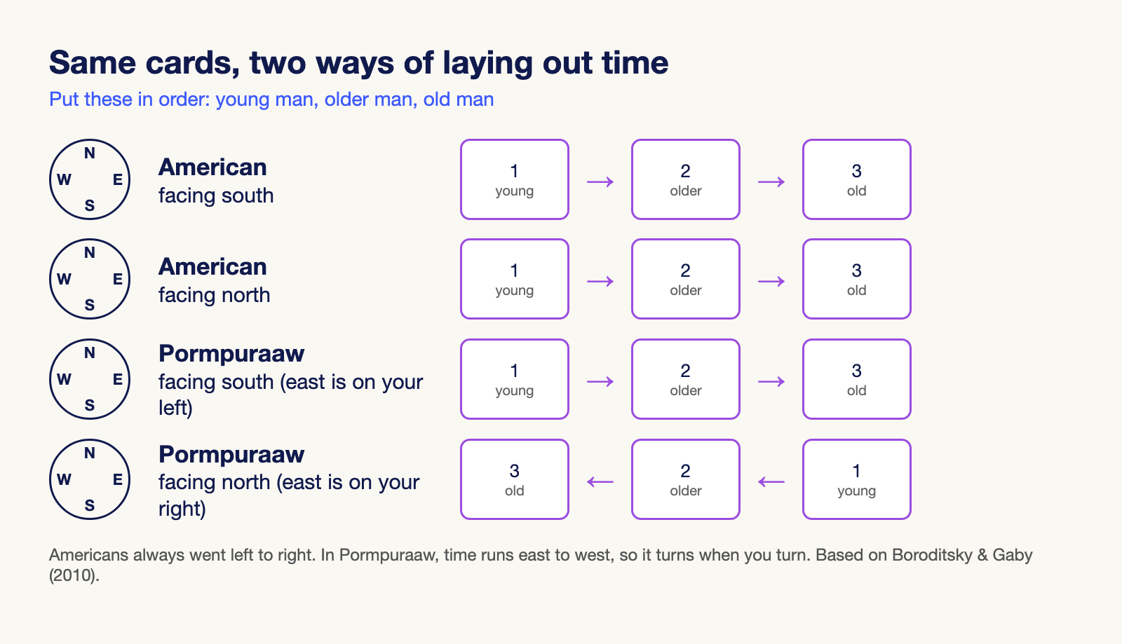
Why east to west? The sun. People there mark the time of day by pointing at the sky, so the sun’s path became the timeline for everything.
So the direction of time changes from one culture to the next. But it gets weirder, because it can flip inside your own head within minutes. Try this one:
“Next Wednesday’s meeting has been moved forward two days. What day is the meeting now?”
If you picture yourself moving through time, it’s Friday. If you picture time coming toward you, it’s Monday. With no context, people split about 50/50. But at San Francisco airport, 76% of people who had just got off a plane said Friday, against 51% of people waiting to pick someone up. They’d just been moving, so they pictured themselves moving.
Personally, I’m sitting at my desk writing this and I’m almost 50/50. But my first reaction was that the meeting got pulled earlier, so Monday. What did you say? Let me know in the comments.
Which button is yes?
Ok, now let’s take a trip to Japan. In Japanese, a circle, maru (○), means “okay” or “correct”, and a cross, batsu (×), means “no good”. You see them all over Japanese test papers.
So when the first PlayStation came out in Japan in 1994, ○ meant confirm and × meant cancel. The controller’s designer, Teiyu Goto, said the circle and the cross were for yes and no (the triangle was a viewpoint and the square was a piece of paper, for menus). But in the West, it was the other way round: × confirmed. Therefore, for 26 years, players in Japan and players in the West pressed opposite buttons to do the same thing.

Then came the PS5 in 2020, and Sony made × confirm in every country, Japan included, so it wouldn’t need different button settings for different countries. Japanese players were not happy: “Sony traitors.” “This is discrimination.” (Although, one person did call it “the first happy news of the year.”)
I’m not much of a gamer myself, so to be honest, I’d have had no idea what any of these symbols meant either way.
But it’s not just circles and crosses. In Japan, a tick (✓) can mark a wrong answer, and the circle is the mark for correct. Same in Sweden, where a teacher’s tick has meant a mistake for over a hundred years. That’s why software made for Japan often swaps its check marks for circles.
Colors do the same thing. In the US, a stock going up is green and a stock going down is red. In mainland China, it’s the opposite: red means up.
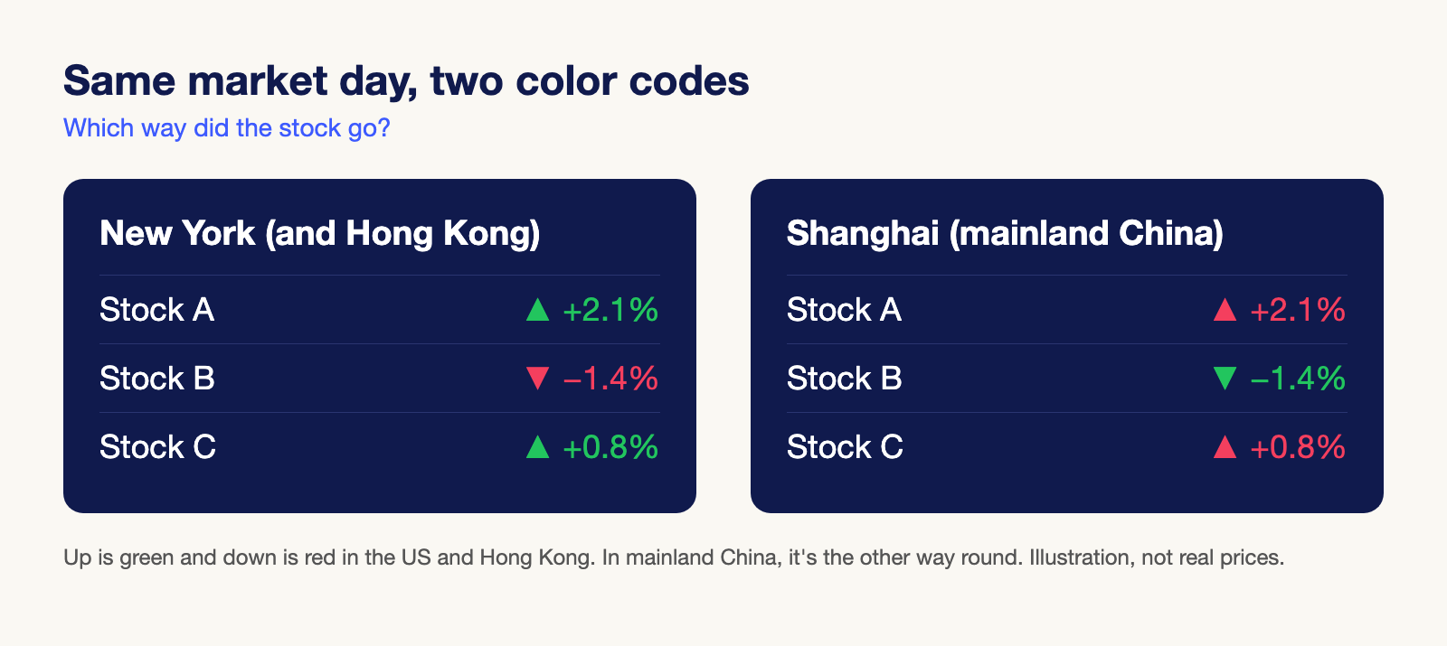
That’s because in China, red is the color of money doing well. A family that’s well off is called a “red door” family, New Year money comes in red envelopes, and big online shops like Taobao use red for the “buy now” button and almost every sale. But Hong Kong, goes with green for up. A study tested both: when the same material was printed in red, people from mainland China predicted more economic growth, and people from Hong Kong predicted less.
This one genuinely blew my mind. China is so big, and something as basic as which color means “up” is flipped for the whole of mainland China. Honestly, it makes me want to visit China!



Made for one country
Ok, now onto the devices. Sometimes the same phone comes out of the factory differently depending on where it’s going.
Let’s start with trains. In Japan, people tap a card called Suica to get through the ticket gates. It runs on a chip called FeliCa that handles “more than 160 million transactions every day” there. Therefore, in 2016, Apple put that chip into the iPhone 7 and Apple Watch sold in Japan, so people could put their Suica card on their phone. Apple added hardware for one country.
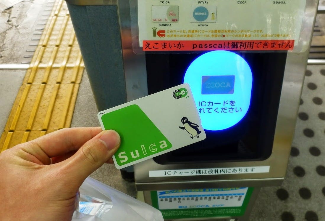

But there was a catch. The US and Hong Kong iPhone 7 didn’t have the chip, so if you wanted Suica, you had to buy the Japanese model, and the Japanese model comes with a camera sound you can’t turn off. Phones sold in Japan play the shutter sound even on silent, to stop people secretly taking photos of others.
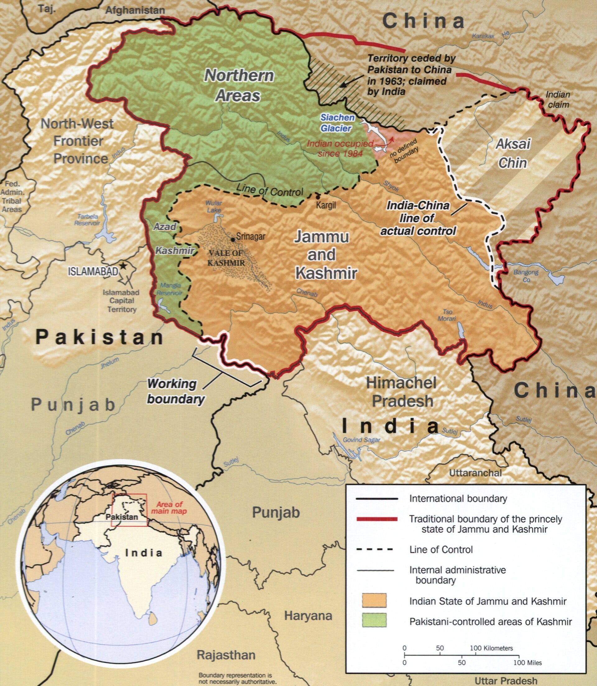
Then there’s the stuff that changes depending on who’s looking. Google Maps draws disputed borders differently depending on where you are. In India, Kashmir shows up as fully Indian, and everywhere else it’s a dotted line. Google says it tries to “objectively display the dispute”. Apple also started showing Crimea as part of Russia for users in Russia in 2019, citing Russian law.

Even emoji do it. Set an iPhone’s region to China, and the Taiwan flag disappears from the keyboard and shows up as a blank box. In 2018, a bug in that code made some iPhones crash when someone typed “Taiwan”.
And sometimes it’s just a number. In Mandarin, “four” sounds almost the same as “death”, which is why a lot of buildings in China skip the 4th floor.
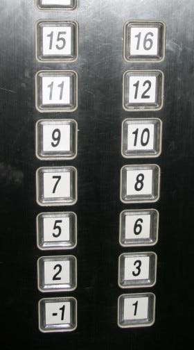

In 2008, Nokia skipped it too. Its phone software went from 3rd Edition straight to 5th Edition:
“As a polite gesture to our Asian customers, we decided [to] move from 3rd Edition directly to 5th Edition. In Asia number 4 means bad luck.” - Nokia, 2008
OnePlus did the same thing in 2017, going from the OnePlus 3 straight to the 5.
Knowledge in whose head?
So what does all this mean for design? Let’s go through the principles.
Natural mapping (how a control relates to what it does) isn’t the same for everyone. I wrote about mapping in an earlier issue. For me personally, right is forward, left is back, top is forward and bottom is back. That’s just a no-brainer. A younger version of me, who was even less experienced and liked to argue, would die on this hill.
Don Norman, the designer who wrote The Design of Everyday Things, thought the same:
“To me, top means forward; bottom, backward. The mapping is clear and obvious.” - Don Norman, The Design of Everyday Things
Then he gave a talk in Asia with a clicker that had two buttons, one above the other. He pressed the top one, and his slides went backward. When he asked audiences around the world which button should mean “next”, they split. If you think you’re moving through the slides, top is next. If you think the slides are coming toward you, bottom is next. It’s the Wednesday meeting all over again.
Reading direction changes it too. In a 1991 study, English speakers placed stickers for breakfast, lunch and dinner from left to right, and Arabic speakers placed them from right to left. Therefore, Google and Apple flip their apps for languages like Arabic and Hebrew: back buttons point right, and progress bars fill from the right.
Then there’s knowledge in the head versus knowledge in the world, which I wrote about in the coins issue. Knowledge in the world is what the design shows you. Knowledge in the head is what you already know. A circle for yes, red for up, a tick for correct: they only work if the person already has that knowledge in their head. And what’s in your head depends on where you were born, where you grew up and what languages you learned. Norman calls these cultural constraints: rules you learned that narrow down what you’d think to do. They work great when everyone shares them, and they break the moment someone from somewhere else picks up your thing.
That’s why I like designing for the real context. When Nokia designed the 1100 in 2003, its research in India found people worried about dust getting in through the keypad and the phone slipping out of sweaty hands, and that a torch would be really useful. So the phone got anti-slip sides, which also helped keep out dust and rain, and a built-in torch, and the Indian ad ended with “Made for India”. It went on to sell over 200 million.
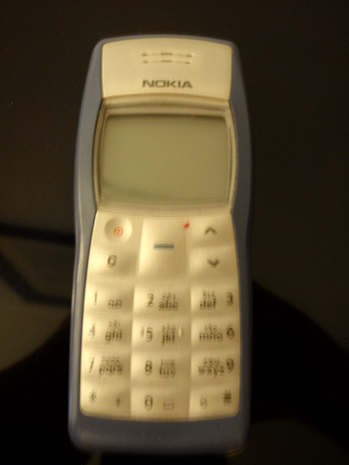

The products that work in a new country come from people who didn’t assume they knew what was needed. They were humble, they listened, they got their boots dirty and they learned the real culture and context.
But it doesn’t always work out, and there are trade-offs. One design for the whole world means someone has to give up their convention, like Japan did with the PS5. A rule made to stop a few people, like the shutter sound, ends up annoying everyone. A map can’t be neutral when two countries draw the border differently. And “a culture” is rarely one thing: Hong Kong reads stock colors the opposite way to mainland China, and younger Aymara people who speak Spanish now point to the future in front of them. So should Sony have kept the circle for Japan? Should a map show you the border your government wants? I don’t think there’s one right answer.